ZooplaPro Style guide and Discovery Phase
CREATING THE STYLE GUIDE
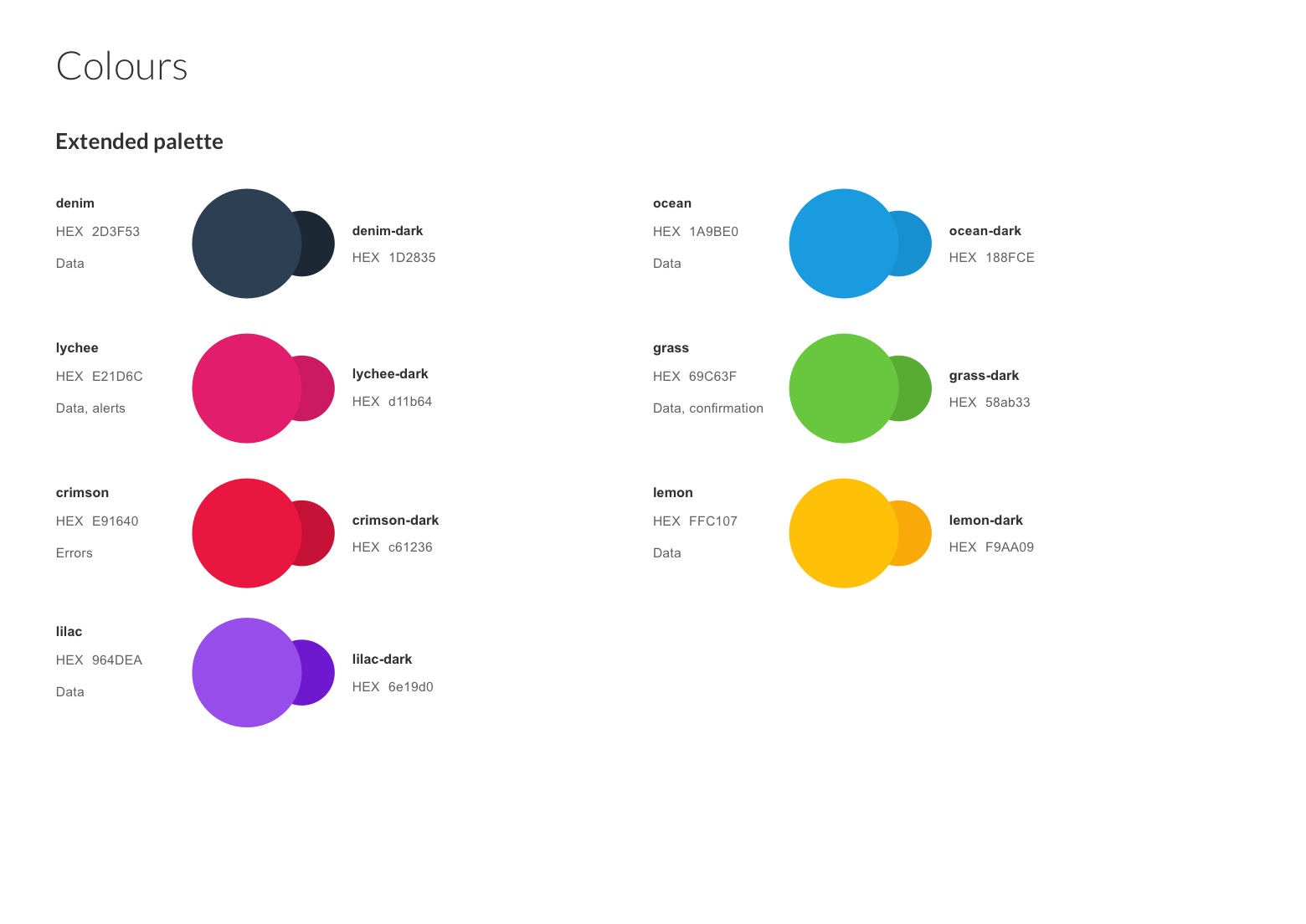
While working on a number of projects for the commercial team at Zoopla I was frustrated by the lack of digital style guide or at least basic brand assets. For my own sanity and to speed up delivery for myself and the junior design team I began to collate design assets and patterns in a rudimentary pattern guide.
This began as a simple colour hierarchy and typographic rules but soon began to grow to include button styles, hover states and tabs. As we completed more projects I began to flesh out the design guide and visual hierarchy further. I felt the principles of Atomic Design would map eloquently over what we had already and allow the guide to grow and develop in the future.
The next step was to audit the current UI patterns and various states we had on the platform. This would help us determine the most common components that had be implemented so far, it would also help us have a wider view of the components and edge cases we would need to be aware of moving forward.
The primary problem with the platform from a user experience point of view was a lack of consistency and obviously, hierarchy. In my auditing I counted over 40 different type styles, multiple link styles and over a dozen different CTA styles. This needed to be solved. While simultaneously working on new projects in our roadmap I continued to grow the atomic pattern guide. I had a particular focus on creating flexible components that were incredibly clear and lightweight. My reasoning for this was that in the absence of major UX changes on the platform this would hopefully drive some immediate changes that would help users navigate and complete actions with more confidence and clarity.
This library was a living document as a Sketch file and then uploaded on Zeplin for the development team to reference. For inspiration we looked to Salesforce, Mailchimp and lonely planet as they are well documented resource guides. They were also primarily backend tools with potentially high level of complexity. We also guerrilla tested in the office with small visual improvements.
DISCOVERY PHASE
This proved to be such a success for the wider team both in terms of improvements for the platform but also with how the team worked. The design guide gave us a north star which allowed us to ideate and iterate quicker, it allowed us to visualise concepts better for external stakeholders and allowed the development team to build quicker.
This opened a wider discussion about the platform’s future and what we could do to improve it significantly. What began as a discussion about improving the basic Information Architecture grew into the business asking me to lead a 12 week discover phase which would explore the wider issue of market fit, a gap analysis and future-proofing the platform.
I kicked this phase off by hosting a workshop with the Zoopla executive team to find consensus on what we were hoping to achieve. From this session we were tasked with documenting their experience on the current platform, what they loved, what their pain points were etc. We were also tasked with the wider objective of finding out what agents wanted from a platform in general and where in their daily workflow we could see a product fit. These objectives were summed up in three basic goals
Make agents love us
Become Self serve (Automation)
Contextual up-selling
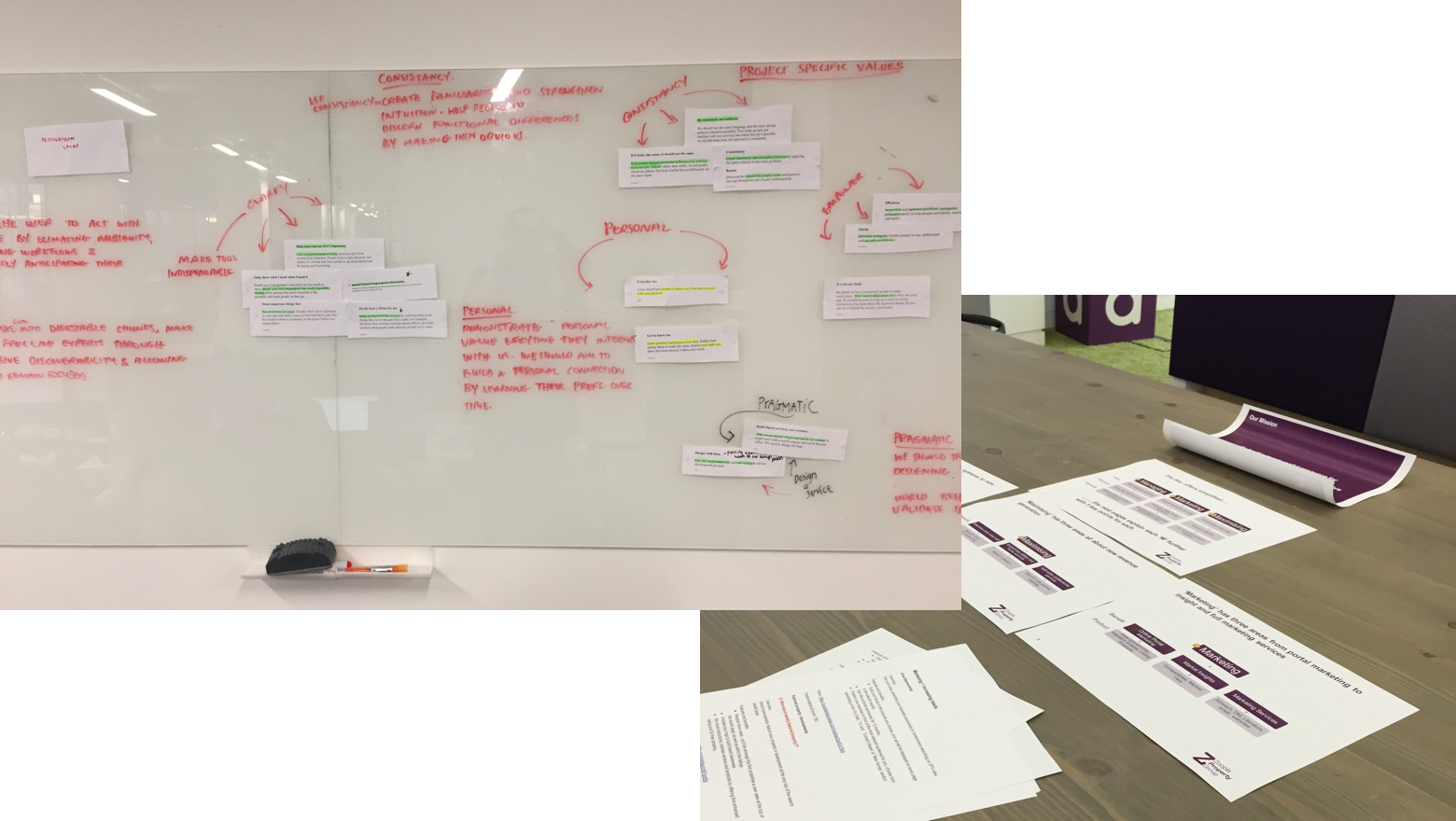
We spent the first two weeks documenting the current architecture and the user on-boarding process - not just from a digital point of view but also off line activities as well (Ie: contract teams set up). We created a feature matrix for the various types of users that existed and the various verticals the platform catered for (Ie: New homes, overseas, commercial etc.)
We met with each department head and documented their experience with the platform. We listed their opinion of the critical activities the platform executes as well as common frustrations and praise they heard from their clients. We also listened to their suggestions for product improvements and discussed what they believed would make the platform indispensible. This qualitive data was paired with the quantative data we had access too. We began with our analytic platform where we analyised the most common user flows, typical user patterns and common drop-off points. We also took time to read through and digest all the NPS feedback the site had recieved. We converted this into heat maps and grouped the common ‘themes’ we saw arise. Finally, we interrogated our bug reporting to see if there were any common problems we could aim to solve.
Findings
As we collated both sources we began to notice issues and ideas frequently arising, we called these ‘assumptions’. Our next step was to validate these assumptions with our user base. We then spent a number of weeks interviewing platform users of differing abilities. We actively spread our interviews across administrative users, branch managers and higher level data analysts to get a firm understanding of their demands. As part of this process we spent days in-branch watching how partners used the platform but also what scrutinising their day-to-day.
This proved invaluable as we were able to unearth some surprising findings. Primarily we discovered little need or demand for a data dashboard. This was surprising as it was currently a major product proposition and the landing page for all users. Most users were under the illusion that it would be useful for other team members but not themselves. The users who wanted data felt the dashboard was “too high level” and those who did not want the data saw it as “not for them”.
This theme continued as we discovered that our users idea of ‘Self-serve’ and our understanding of self-serve were not aligned. The business had be working under the understanding that if the platform were more user friendly it would equate to more engagement and therefore users would see it as more valuable. However, we discovered in discussing with a majority of agents that they would derive more value from the platform the less the had to engage with it. This was a vital finding as up until that point the businesses’ intention had been to move the platform towards becoming a ‘one-stop shop’. This was only two of a total of 12 key findings. (For obvious reasons I am unable to discuss further findings in the report.)
Our discovery phase culminated in a 29 page report and series of presentations to the executive team, department heads and then the wider company. We also proposed two possible solutions that we saw as feasible ways to move forward. These required the business to make decisions on where they saw the future of the product heading and placed the re-platforming on the overall product roadmap.


